Helping People Find a Channel to Listen To

Initially when taking on a redesign of SiriusXM’s channel guide, I thought it would be a relatively straight-forward lay-up. How complicated could it be? It’s just a list of channels. 

In actual practice, it turns out the channel guide mediates some of the most complicated and important parts of the SiriusXM value chain. From helping new users convert to subscribers, to helping existing subscribers find a show or sports event to tune into, the channel guide plays a central role in the SiriusXM experience. 

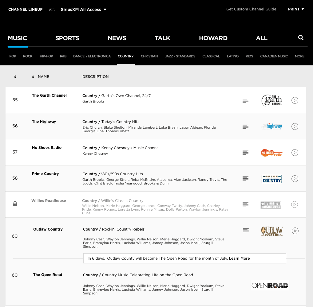
At its most simplest description, the problem was about helping users process a large amount of complex information. To that end, I made a successful argument to build and test with a real HTML prototype which gave us rich insights into user patterns.

What
HTML prototype

Role
Design, Development, Usability Testing

Client
SiriusXM

Year
2018

Where we started

This is the old channel guide. It’s made with tables. It’s not responsive. It has a few unusual and confusing conventions to surface up our online content.

As a starting point, we pitched the new redesign with the following bullet points

  • Responsive layout (the mobile-only site was an unthemed jquery-mobile page with bad UX)
  • Searchable – 300 rows of content is overwhelming
  • Easier for users to understand and evaluate (surface recognizable artist names, instead of genre descriptions)


Research

The research phase on this was significant. A quick look at the traffic showed that this page was critical to several purchase flows. Users were bouncing between the channel guide and our package presentation page; presumably trying to make sure the channels they wanted were in the package they were getting. This insight was key; in SiriusXM’s metrics-driven culture, tying your work back to the value chain (getting more subscribers) was a critical part of stakeholder engagement.

Surveys

In addition to traffic analysis, we also deployed a series of surveys, which yielded some of the most actionable insights. The key answers we were able to extract were:

  • Visitors to the channel page and its variants were there for the same reasons, which were in-order:
    • To look up a channel number for a station that they already like
    • To find a sports broadcast
    • To make sure the channel they liked was in the package they were ordering
    • To find out what song played at a certain time and channel
    • To get the latest updates on channel changes and temporary ‘take-overs’

Initial Wireframes

Wire-framing this up was relatively straight-forward. The basic page construction was very simple, being made up of just two components: a row and a filter-block.

Visually, our approach was to keep it minimal, with ample white space to aide easy scanning, and guide the eye through the content.

The layout for the top navigation drew inspiration from vintage radio tuners. The black background with gotham in all caps white seemed lock in really nicely, creating a plausible context for our blue link color to serve as a underline indicator.


Moving to Code

As we layered in the detail, we quickly ran up against a very steep curve of complexity.

  • Search, a key feature, was impossible to test with static screens with a sketch+invision workflow
  • We had to present a high volume of data very accurately – our testers were familiar with SiriusXM, they knew the channels and their numbers. Using lorem-ipsum would have confused them and produced false negatives in our test results.
  • Our baseline usability test used tasks were based on the current channel guide – switching to a static mock-up, would have yielded a lot of surface area for distorted test results.

Facing these challenges, I put forth the idea of re-building the prototype with html/css/js.  A live code channel guide would offer up a better apples-to-apples comparison with the current channel guide. Also, working off a JSON feed of the channel feed gave us the freedom to easily represent the channel guide through the matrix of radio platforms (Sirius, XM, SiriusXM) at each of the subscription tiers (mostly music, select, all access).

However, there were serious concerns raised about the time to deliver and the maintenance overhead of supporting a code prototype. So, as a test, we gave ourselves 2 days to complete the prototype. If we missed that deadline, we’d know it was too complex to take on and we’d have to build our prototypes with sketch+invision.

As it turned out, two days was exactly the time we needed to build the prototype! It was a major win for us. We could now move forward with usability testing a week ahead of schedule.

Usablity Testing

With a kick-butt HTML mock-up in hand, we were able to jump right into usability testing. We opted for unmoderated usability tests, working on an enterprise account with usertesting.com.

The Results

The results were very positive but also very humbling:

  • The new page performed really well, with users completing each task 50% faster over the baseline (old version)
  • Nearly all users testing on the new page USED SEARCH
  • We tried playing around with the order of the nav elements – there was no real clear winner
  • We tried playing around row layouts – that didn’t matter much either
  • Adding recognizable artist names to channels didn’t seem to help as much as we were expecting it to

To be fair, our sample size was probably too small to correctly validate the last three points. That in of itself was a lesson learned in terms of how to sequence the testing objectives and scope them towards the right audience size.

Edge Cases

Since the unmoderated tests took a week to process, we had time to go back and think through the “edge-cases” with presenting channels. I use the term “edge-cases” lightly, because with 30 million subscribers, an experience seen by .01% is 3,000 people.

In order, the following screenshots show potential solutions for:

  1. Displaying a temporary channel take-over (responding to feedback from the survey)
  2. Displaying an upsell landing page when a user on low-tier subscription clicks on a premium sports offering (MLB)
  3. Displaying sports schedule for local teams
    • (channels for live games rotated on a weekly basis and needed to be displayed in a schedule format)
  4. Another iteration of the sports schedule display

What we learned

All told, this was a fantastic project. Testing with real code is a UX methodology that I will always fight for, especially when it comes to asking users to process large amounts of data.

Even beyond that, a coded test platform readily absorbed the dozens of testing ideas from a wide swath of stakeholders at SiriusXM, creating a more inclusive and collaborative design dialog while also making our team smarter in the process.

This was one of the few projects that I worked on where I felt there was a meaningful shift in the culture towards a user-centered design process. Stakeholders were meaningfully engaged in the problem-solving process. The debates were focussed on real issues confronted by users, with formal design considerations prioritized at the appropriate level. The end result was something everyone could feel confident in, as we knew we had made great strides in improving a critical part of the experience for our customers.

Live Demo