In 2016 I was tasked with presenting a new vision for SiriusXM’s central bill paying portal. Known internally as as the OAC or “Online Account Management,” it is one of the core web experiences for SiriusXM subscribers.
Helping Subscribers Pay Their Bills.
What
Interactive mock up
Role
Research, Testing, Design
Client
SiriusXM
Year
2017
Collaborators
Jan Maska
Project Goals
- New look and feel: The current look and feel hadn’t been touched since 2010.
- Better expose self-serve functionality to users in order to drive down call volume.
- Increase sales by surfacing more upsell and upgrade CTAs through out the experience.
- Soften the experience by introducing positive feedback and friendly language.
Where We Started
- The current bill pay flow was really old and really confusing

Research and Planning
Research for this project was rigorous. It encapsulated nearly a month of interviews and analysis.
- Interviewed business owners to understand the legacy billing logic.
- Looked into analytics to understand how user are navigating through the current billing system.
- Analyzed a year’s worth of customer satisfaction surveys.
- Card sorts: Are we using the right taxonomy?
- Heuristic Analysis: Were there any obvious dead-ends in the user pathways?

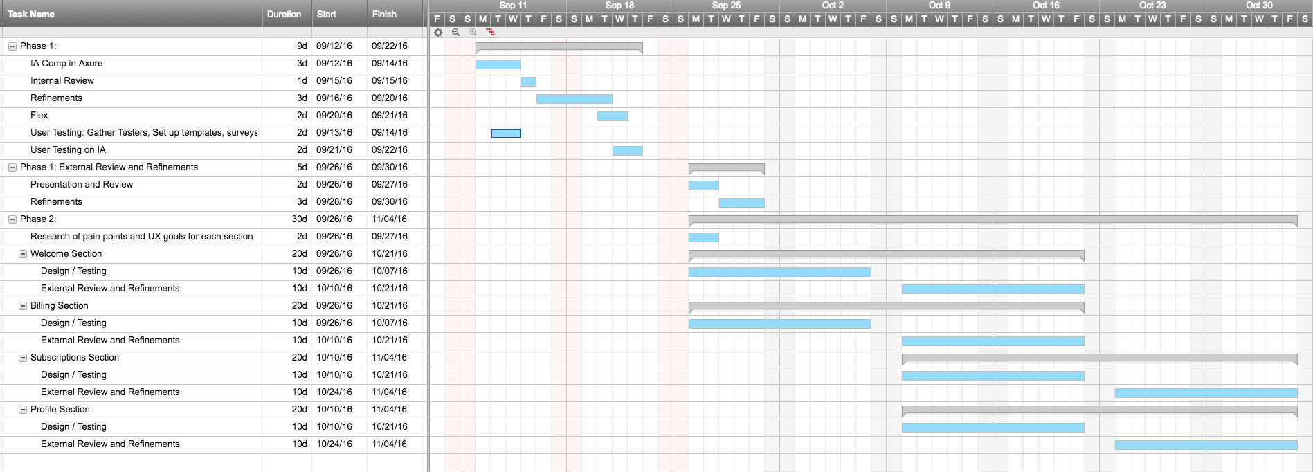

First Round Wireframes
- We started out with rough wireframes and then realized the core of the experience was about organizing specific information, so we switched to higher fidelity wireframes
- Explored top navigation, side navigation task-context navigation.
- The wireframes developed concurrently with our stakeholder interviews and research, updating the wireframes along the way.

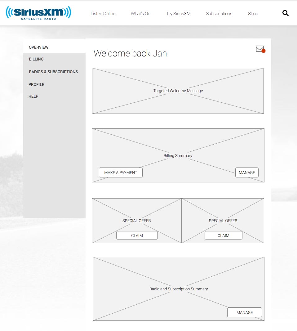
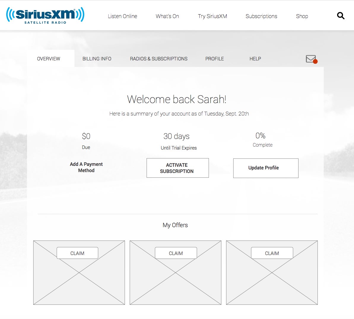

Usability Testing
- 6 test subjects from a variety of ethnic, income and education backgrounds.
- Each user was given a two part test, with a different layout for each part.
- Users were asked to complete basic tasks like paying their bill, adding a subscription and changing their account information.
- Measured time-to-task and accuracy.
- Users had difficulty understanding their subscriptions across both prototypes.
- Users also struggled to understand expander / dropdown affordances.


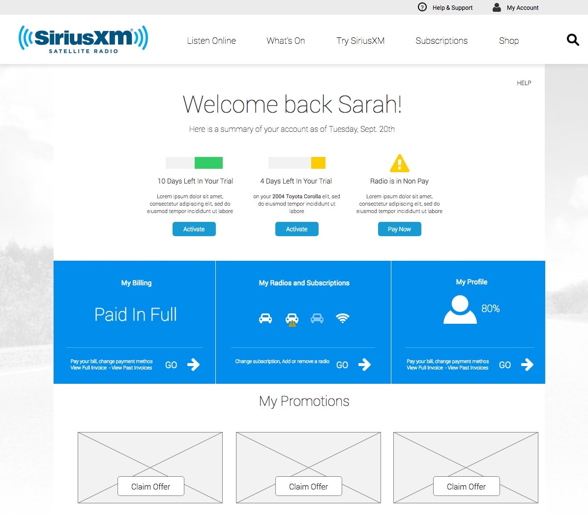
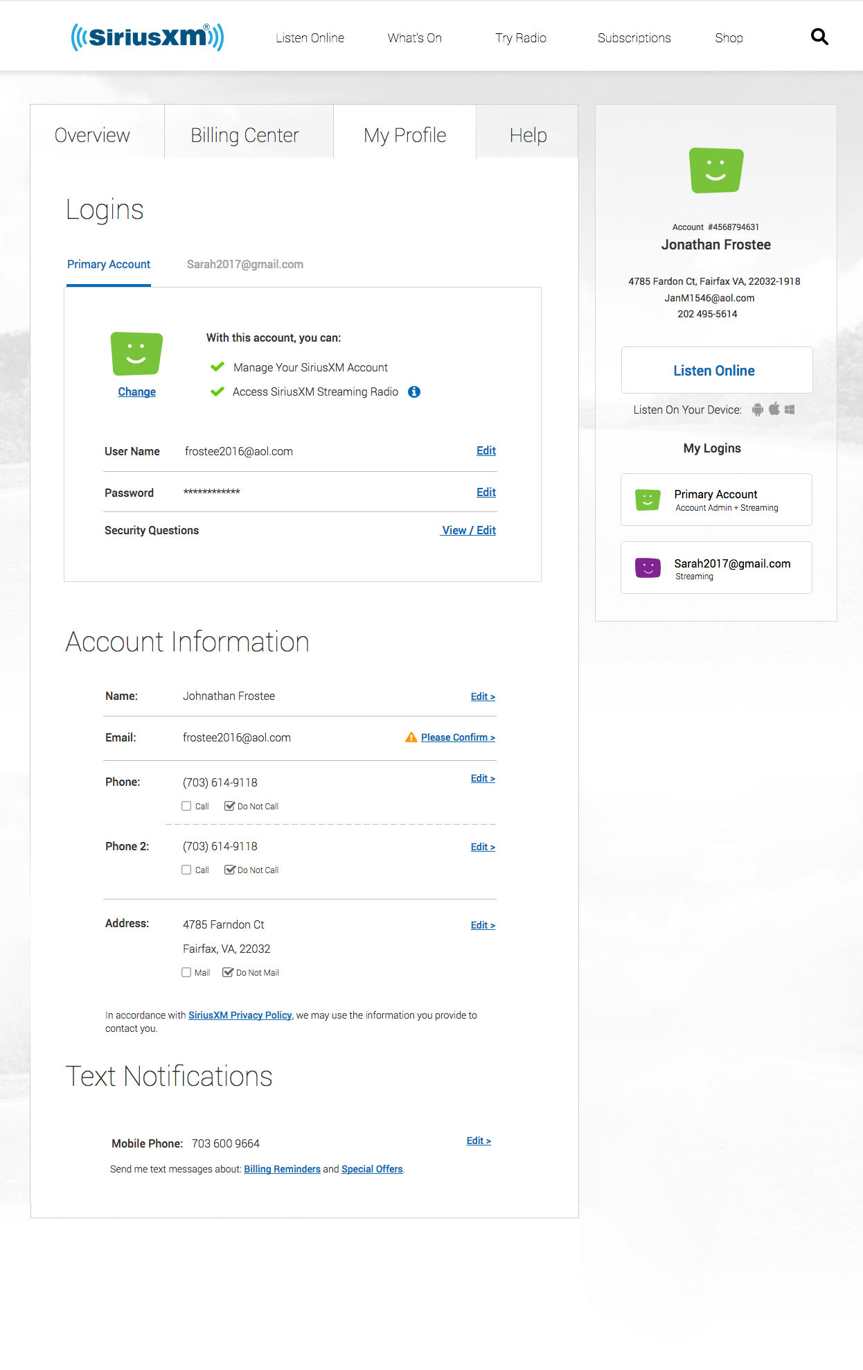
Final Prototype
- Incorporated lessons from the user testing and the other prototype.
- Despite looking fairly polished, these are wireframes. There are a few small visual design issues to work out.


What We Learned
- Usability testing can be resource intensive. It takes a lot of work to build the list, facilitate the design and analyze the data.
- Usability testing will reveal a lot of unexpected information about how users perceive and complete tasks.
- This project was a rigorous effort in deciding how to reveal information to a user.